Mastering Data Visualization in the AEC Industry

State of the Art
I love glorious and beautiful graphs, renders, and diagrams. When I used to design buildings, I was craving to sell a project idea to the client using the best graphic resources out there. I’m sure I’m not alone, even more after seeing so many posts of surrealistic buildings created by AI tools (like the one we did), but this also ends up being a problem.
We are so used to and amazed by visualizing 3D models in general that we pay little attention to how to visualize data correctly. But fear no more; this post is here to help!
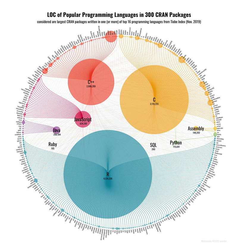
I have learned that people are always intrigued with polar charts like the one above, which display the most used programming languages in a popular package library. I just wanted to add this as a warm-up.
How Does Data Visualization Work?
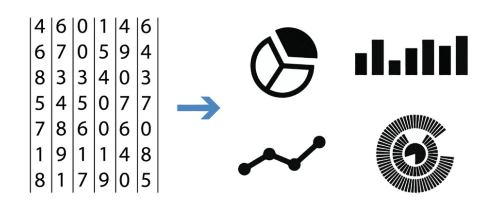
A primary goal of data visualization is to communicate information clearly and efficiently via statistical graphics, plots, and information graphics. Effective visualization helps users analyze data and evidence. It makes complex data more accessible, understandable, and usable. Users may have particular analytical tasks, such as making comparisons or understanding causality, and the design principle of the graphic follows the task.
Imagine the chart above as an excel file with numbers instead of colors on each row. The comprehension of the information would be much more difficult. Data visualization is an intro to the strategic use and displaying of information in a different format. It is a way of communication that can change the perception of the target audience and can deeply affect what decisions are made.
Why is data visualization important?
Data visualization is crucial because it transforms complex data sets into clear, understandable visual representations, allowing for quicker comprehension, analysis, and decision-making. By presenting data in charts, graphs, and maps, it highlights trends, patterns, and outliers that might be missed in raw data. This facilitates more effective communication of insights, aiding stakeholders in grasping complicated concepts and making informed decisions. Moreover, visualization aids in identifying areas that require attention or improvement, supports the spotting of correlations and causations, and enhances the ability to forecast trends, making it an indispensable tool in data-driven environments.
When to Use Data Visualization?
Data visualization is a must when dealing with large amounts of data. Any organization can benefit from a clear visualization that can provide insights instantly compared with a clutter of numbers in multiple spreadsheets.
In the AEC industry, we deal daily with a large amount of data on every construction phase, so our industry is a great fit.
We could fill thousands of pages with different examples starting from BIM models where we could display data on the quality of the design, the model itself, or even the performance of the BIM modeler (like BIMBeats does) to on-site info like the performance of subcontractors, material cost, to even areas like sales, marketing, or human resources.
I have created a graph below divided by each construction phase that helps to visualize what I tried to explain above:
| Feasibility | Design | Construction | Operation | Refurbishment |
| Best land to develop based on cost | Percentage of private and public areas in a building | Performance of subcontractors | Usage of the different areas of the building | Functionality based on the use |
| Best use of the lot | Circulation from each place in the building | Presenteeism | Cost by assets | Budget per area of the building |
| ROI options | ROI options |
Let’s Get Started
When creating a visualization, the first step is to be clear on the question to be answered. “How will the visualization help the reader?”
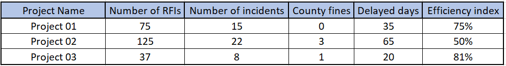
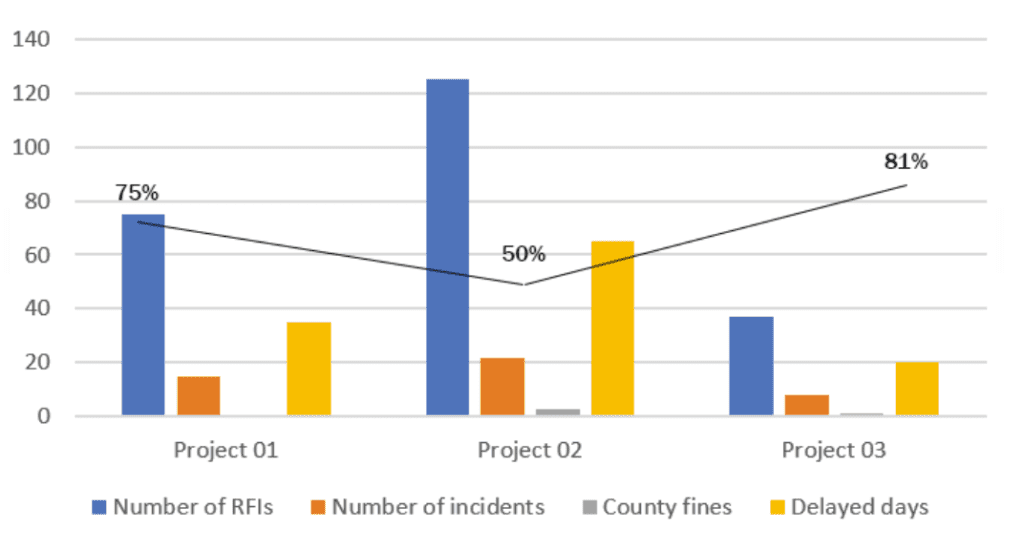
Having a straightforward question to answer helps avoid a common problem in data visualization: Comparing “apples” to “oranges.” Consider a hypothetical dataset (see Figure 01) in which we have information on the project’s total number of RFIs, incidents, county fines, delayed days, and their respective efficiency index. A bad example of visualization is shown in Figure 02, where all the variables are included in the same chart making it confusing and failing to provide a precise reading to the user on what it’s trying to be explained here.
We Need to Understand the Data We Want to Visualize
Since every project has different requirements, your visualization should convey the unique qualities of the data set it represents. This is important because you might want to visualize something but the data available is not suitable for that (for example, not having a method available on the Revit API) so you have to work with what you have. Or it might be the case that is incomplete and will never lead you to a particular conclusion.
If you are looking to test something or you want to find specific data, there are many sites like Google Data Search, Kaggle, Data.gov, Datahub, or even a site with earth data compiled by NASA
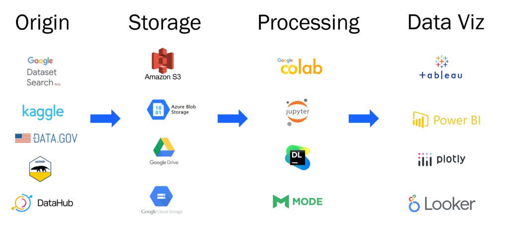
1. Acquire
The first stage of data visualization is obtaining the data. Data may be retrieved from your on-premise servers or a cloud-based storage service like AWS, Microsoft Azure, or Google Cloud.
When acquiring data, consider how it can change, whether occasionally (monthly, quarterly, annually, etc.) or perpetually.
For example, let’s suppose you are looking to do quality control on the status of a BIM model. In that case, you might want to export data out of Revit daily to ensure the quality stays on track. On the contrary, if you want to know the efficiency of a Revit modeler, you might want to obtain data monthly that can be more representative than doing it daily.
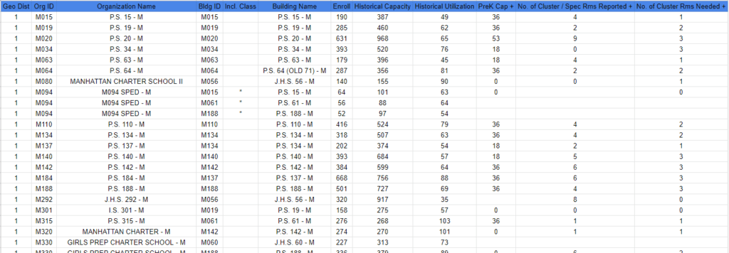
For this post, we will use a public data set from data. world, we have selected the Enrollment, historical capacity, and utilization data for every school in New York, and we are going to store it on google drive. If you want to access the code of the whole process, you can access this google collab and check out how we used Plotly for each of the graphs.
The selected dataset has 12 fields: District, Organization_id, Organization Name, Building_id, inlcudes_class, building_name, #_enroll, historical_capacity, Historical_utilization, prek_cap, no_of_cluster_spec_rms_reported and no_of_cluster_rms_needed.
2. Filter Only Relevant Data
Only some aspects of a data set are relevant. Often, less detail will convey more information because the inclusion of overly specific details causes the viewer to miss what’s more important or disregard the image entirely. After all, it’s too complicated. Filter the data to remove portions of minor to no interest.
In our case, we will eliminate fields like “inc_class” that are not needed, and almost all of the cells are empty.
We end up only with a subset of 4 fields:
3. Apply Data Mining Methodologies
Use statistics and data mining methodologies to spot patterns or put the data in a mathematical context.
In this step, we are going to define what are the relations that we want to get out of the data. In our case, we want to know if there is a pattern between the actual use of the schools versus the enrollments in specific districts of New York.
Graph Selection for Data Visualization
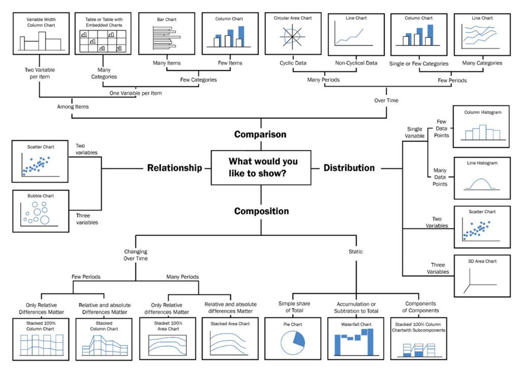
Once you have precisely what you want to present comes the graph selection step; quoting Andy Kirk in Data visualization a handbook for data driven design
“Choosing which chart type(s) to use is inevitably, not a single-factor decision. Rather, as ever with data visualization, it is an imperfect recipe made up of many ingredients.”
This gets even worse if we consider that every day new types of charts are created. Still, some rules can be followed to select a proper graph that works for the desired purpose; my favorite is the one made by Dr. Andrew Abela:
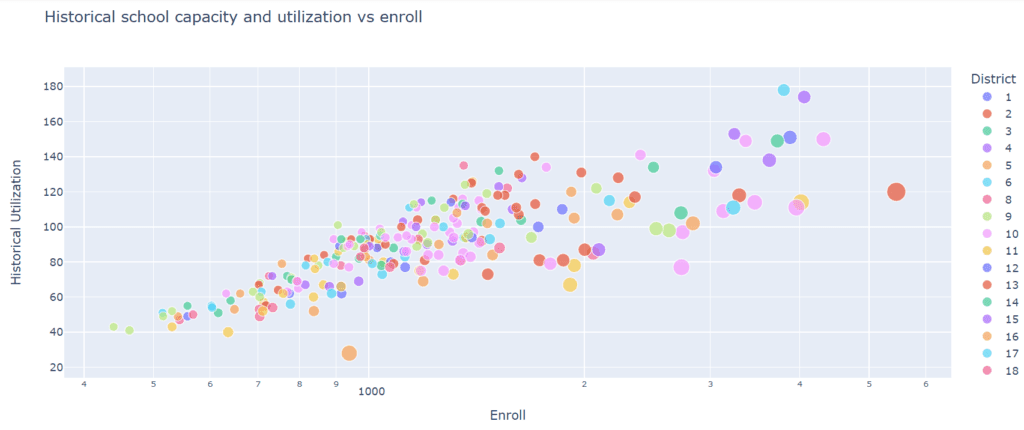
In our case, we want to show the distribution of the historical utilization versus the enrollments in the different institutions, so we decided to use a scatter chart or to be more precise a bubble chart.
Scale Definition
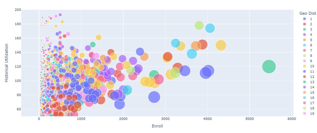
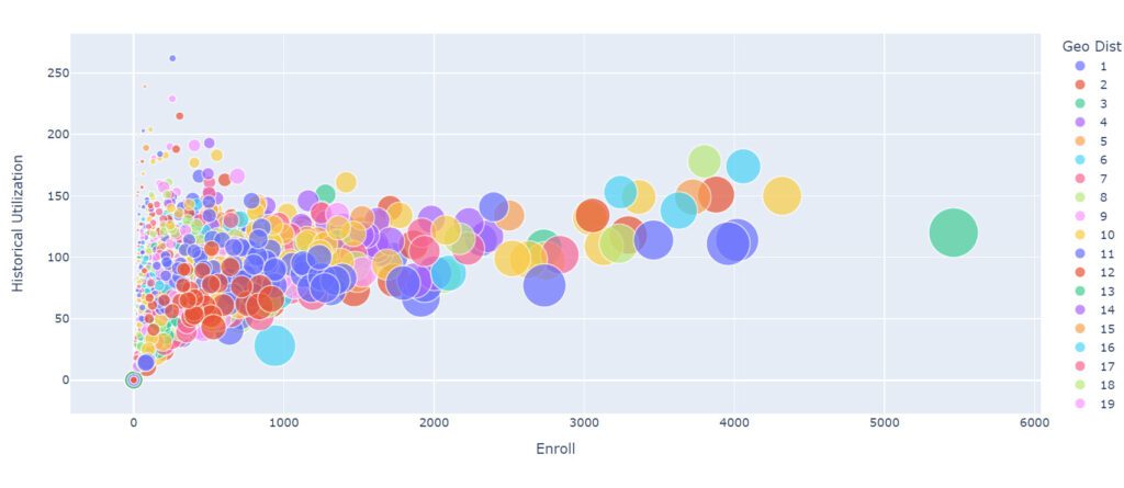
We have already selected our graph type, and now we need to define the proper scale, and this is not a minor detail. If a proper scale is not set, it can be deceiving for the audience; a difference between two factors can be enlarged or shortened depending on what is being decided.
Below are some examples where we adjusted the scale and got different outcomes.
In this case, we adjusted the graph’s vertical margins to make sure no data points end up outside the bounds.
We can increase the scale of the spheres, but this ends up providing a more confusing graph; although sometimes exaggerating the scales gives me a better perspective to find the ideal one.
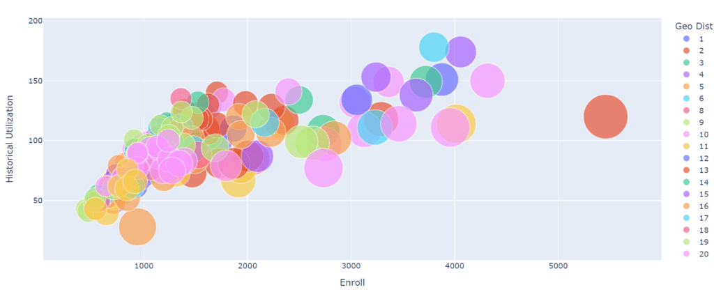
In this case, we also added a filter of schools with a capacity of more than 1000 was applied.
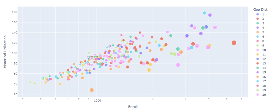
In this case, we decided to make the spheres smaller, so there are not that many spheres overlapping, providing a more precise experience to the audience also a log scale was used to separate the data points.
Annotation
Annotations are extremely important, and it is what gives clarity to the user when looking at them.
Many libraries like the one we are using and specific software do not add titles to graphs, which is a big mistake as it provides a guide to understanding the graph.
Another critical aspect to consider is that sometimes the fields on a DB are slightly confusing, like “Geo Dist” so you can change it to something more explicit like “district.”
Color
In this field, colors are your best friend and the most powerful tool. They create contrasts, accents, and emphasis and lead the eye intuitively. Even here, color theory is essential.
When you design your chart, ensure you don’t use more than 5 or 6 colors. Anything more than that will make your graph overwhelming and hard to read for your viewers.
However, color intensity is a different thing that you can use to your advantage. For example, when you compare the same concept in different periods, you could sort your data from the lightest shade of your chosen color to its darker one. It creates a solid visual progression proper to your timeline.
Things to consider when you choose colors:
- Different colors for different categories.
- A consistent color palette for all charts in a series that you will later compare.
- It’s appropriate to use color-blind-friendly palettes.
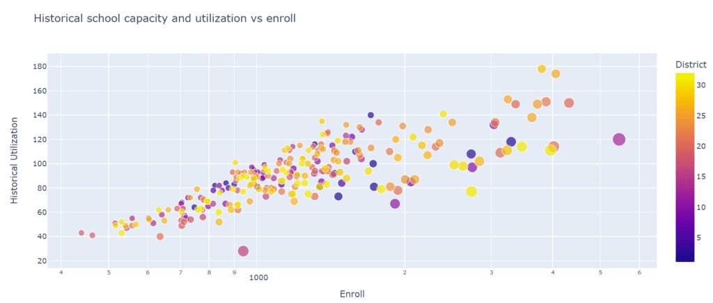
In this case, the appropriate path would have been to assign a unique color to each district, given that this is a categorical property. Still, when there are many elements, like in this case, it makes it more difficult as the reader has to go back and forth to the references all the time. Given that we don’t have names of districts but numbers, we decided to map the numbers to a degraded color scale. As you see, sometimes, there are exceptions depending on each case.
Which Tool to Use for Data Visualization?
A question I get a lot is why we select the tool after the whole data visualization process. Some people might be constrained to specific tools because that is what they use at the office, but if possible, it is better to design all the graphs and then select a tool, so you make sure it is the one that adapts the most to what you need. Some tools might have a different graph than you desire or might even be limited in how to filter the data.
Data visualization used to be a domain that was reserved only for developers who knew how to transform data into nifty-looking charts online, nowadays even when there are still libraries like Matplotlib or Ploty that only software developers can use, there are a lot of options where coding skills are not needed. Examples like this are Looker Studio, Power Bi, or Tableau: robust online solutions that allow anyone to visualize data.
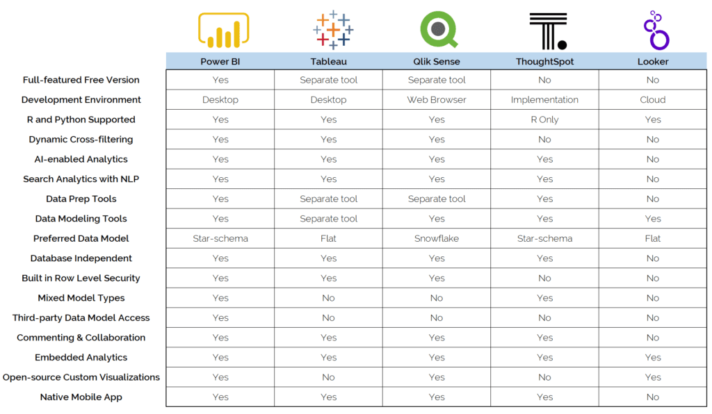
We are not going to deep dive into which tool to use because that could take us an entire post, but for the sake of providing a starting point, you can find a comparison chart below of the most common solutions in the market.
A Bright and Colorful Road Ahead
Even when the subject seems relatively easy, as seen in this post, doing a killer visualization is not that straightforward and involves a lot of knowledge and practice. Also, as we mentioned before, this is a science and art at the same time, where the importance of the data is equal to the public to whom the chart is aimed.
The good news is that frameworks, programs, and libraries are advancing more and more every day, making things easier. In the future, we might even have an AI tool that automatically could provide us with options on the best-looking graphs.
What about you? How do you envision this is going to be in the future?
We are not going to deep dive into which tool to use because that could take us an entire post, but for the sake of providing a starting point, you can find a comparison chart below of the most common solutions in the market.

Valentin Noves
I'm a versatile leader with broad exposure to projects and procedures and an in-depth understanding of technology services/product development. I have a tremendous passion for working in teams driven to provide remarkable software development services that disrupt the status quo. I am a creative problem solver who is equally comfortable rolling up my sleeves or leading teams with a make-it-happen attitude.